Covid-Mapping
Lab 3: Web Mapping Covid Cases by County Across The US </br>
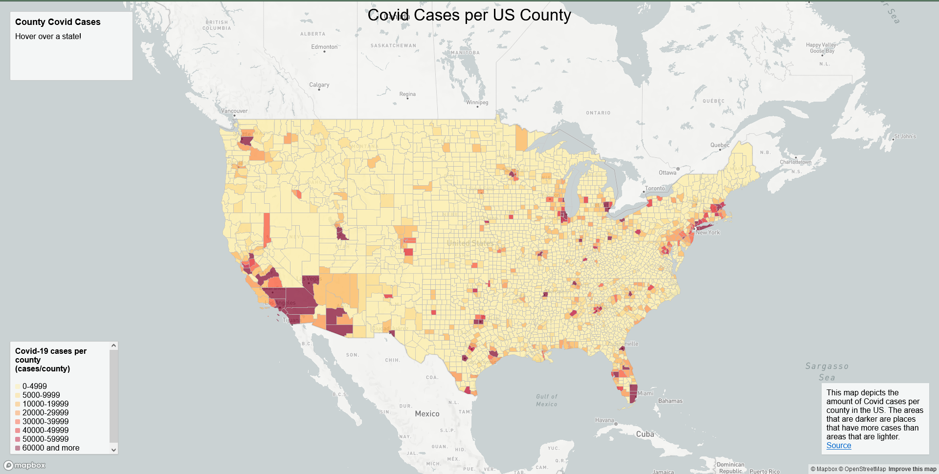
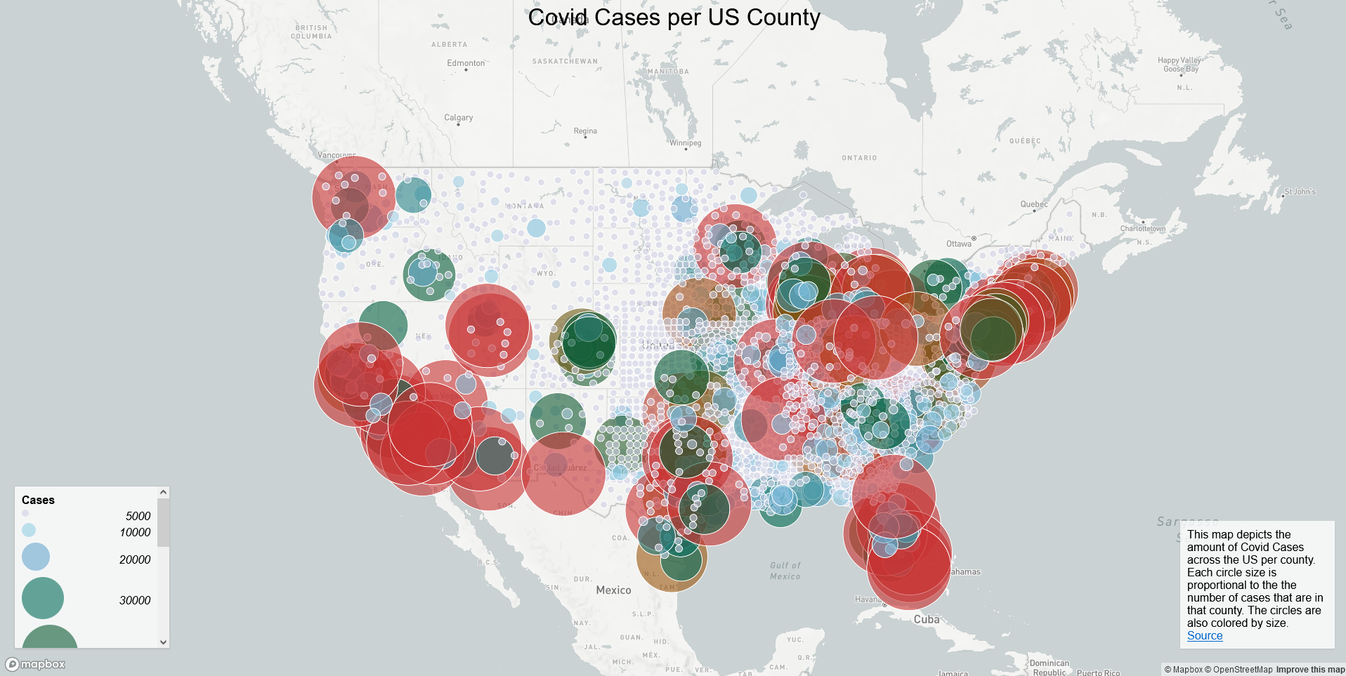
In this project, I used mapbox to create a map of the covid cases in the US. I got data from The New York Times, 2018 ACS 5 year estimates, and US Census Bureau. These data were mapped in two different styles. One was a choropleth map, and the other was a proportional symbol map. I used the choropleth map to show the number of cases per county, and the proportional symbol map also showed the same data but now in a proportional symbol style.
Here is a preview of the first map
Here is a preview of the second map
Since these maps are interactive you can head to the github pages url for this repo and interact with them. The basic functionality includes extra information when hovering over a county on the choropleth map and when clicking on a dot on the proportional symbol map.
Libraries used </br> MapBox
Recources used </br> The New York Times </br> 2018 ACS 5 year estimates </br> US Census Bureau
This project was done as an assignment for GEOG 458 at the University of Washington. Here is the github page for this class.